What That Wine Bottle Label Really Says About the Wine
Imagine picking up two bottles of wine that cost the same. One has a clean, modern label with a bold font and shiny gold edges. The other has a basic white label with faded writing and no design. Most people would say the first one looks fancier—and a lot of them would also assume it tastes better. That’s the weird power of wine labels.
Even before a single drop is tasted, the bottle’s label is already shaping what someone expects from the wine. It’s doing way more than just naming the product. It’s telling a story, setting the mood, and quietly influencing whether the bottle ends up in someone’s shopping cart—or gets passed over completely.
Labels Build Expectations Before a Sip Is Taken
People often judge a wine by its label without even thinking about it. A dark label with heavy fonts might make the wine feel rich or serious. A bright, colorful label might make it seem fresh or playful. These are guesses based only on what the eyes see, but the brain connects that look with what the wine might be like.
That’s why the wine bottle label is such a big deal. Wineries know they’re not just putting a sticker on glass—they’re making a first impression. In fact, some companies spend just as much time designing their label as they do planning the wine inside.
This is especially true for new wineries trying to stand out in a crowd. On shelves filled with choices, a good label can be the one thing that makes someone stop, pick up the bottle, and consider buying it. Many winemakers now focus on custom designs that match the personality of their brand, the type of wine, or even the vibe they want people to feel when drinking it. For example, using a wine bottle label that matches the winery’s style helps tie everything together—from the vineyard to the store shelf.
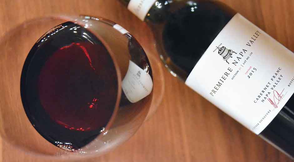
Fonts, Colors, and Tiny Details All Matter
It’s not just about what the label says, but how it says it. A fancy script font can make a wine feel classic or high-end. A bold, simple font might make it feel trendy or bold. Colors also add to the feeling. Deep reds, golds, or black can suggest luxury. Soft pastels or earth tones might give a relaxed or natural vibe.
Even textures play a part. Some labels are smooth and glossy, while others have a rough or textured feel. That might sound small, but it affects how people view the product. A soft-touch or embossed label can make the bottle seem expensive before the cork is even pulled.
Designers often test different versions of labels to see which ones people respond to most. It’s not random—it’s part of a strategy to send the right message. The goal is to match the feeling of the label with the experience of drinking the wine. When that happens, people feel more connected to the brand and are more likely to buy again.
Labels Help Tell the Story of the Wine
People love stories. Wine labels are a great way to share them. That might be the story of the vineyard, the winemaker, the type of grape, or even just a feeling the wine is supposed to create.
A good label can quickly hint at what the wine is about without needing a long explanation. A hand-drawn label with a picture of a farm might give the feeling of a small, family-owned winery. A sleek, minimal label might suggest a modern, science-driven approach. It’s all part of creating a personality for the wine.
This is especially important for younger wine drinkers, who often care about where their food and drinks come from. They want to support businesses that share their values, and the label is often the first clue they get. A well-made label can make a wine feel authentic, interesting, and worth trying.
It’s Not Just About Looks—It’s About Trust
Once someone finds a label they like, they tend to stick with it. The label becomes part of what they trust. They might not remember the name of the wine, but they remember the color or the picture on the front. That’s why changing a label too often can confuse customers.
When a label is well-designed and matches the quality of the wine, it builds loyalty. People begin to trust that wine—not just because of how it tastes, but because of how it makes them feel. The label is a big part of that feeling.
Wineries that want long-term success often invest in consistent branding. That means making sure the label stays connected to the wine’s quality and message over time. This doesn’t mean the label can never change, but it does mean every change needs to be thoughtful.
Shelf Impact Is a Real Thing
In a store with hundreds of bottles lined up, most people don’t have time to study each one. They scan the shelf and grab what stands out. This is where label design really proves itself.
Some labels use bold colors or unique shapes to catch the eye. Others use metallic ink, embossed letters, or unusual artwork. The goal is to make someone stop for just a second longer than they would have. That moment of attention is sometimes all it takes to earn a sale.
Even if the wine is amazing, it won’t get a chance if the label doesn’t stand out. That’s why packaging is just as important as the product. A great label doesn’t just look nice—it works hard behind the scenes to get that wine into someone’s hands.
What It All Means
Wine labels do more than name a bottle. They guide choices, build trust, and even change how people feel about the wine before tasting it. Every part of the label—from the font and color to the paper and texture—adds to that first impression.
When done right, a label becomes part of the wine’s story. It connects the person drinking it to the people who made it. It tells them what to expect, even if they’ve never tried that wine before. That’s why smart wineries put so much thought into their labels. They know that in a world full of choices, a few square inches of paper can make all the difference.
What to Remember
A wine label isn’t just a design—it’s a message. It sets expectations, builds trust, and helps products stand out in a crowded market. Whether the wine is bold and serious or light and fun, the label helps tell that story. And for anyone choosing a bottle, that label might be the first—and only—reason they give it a try.